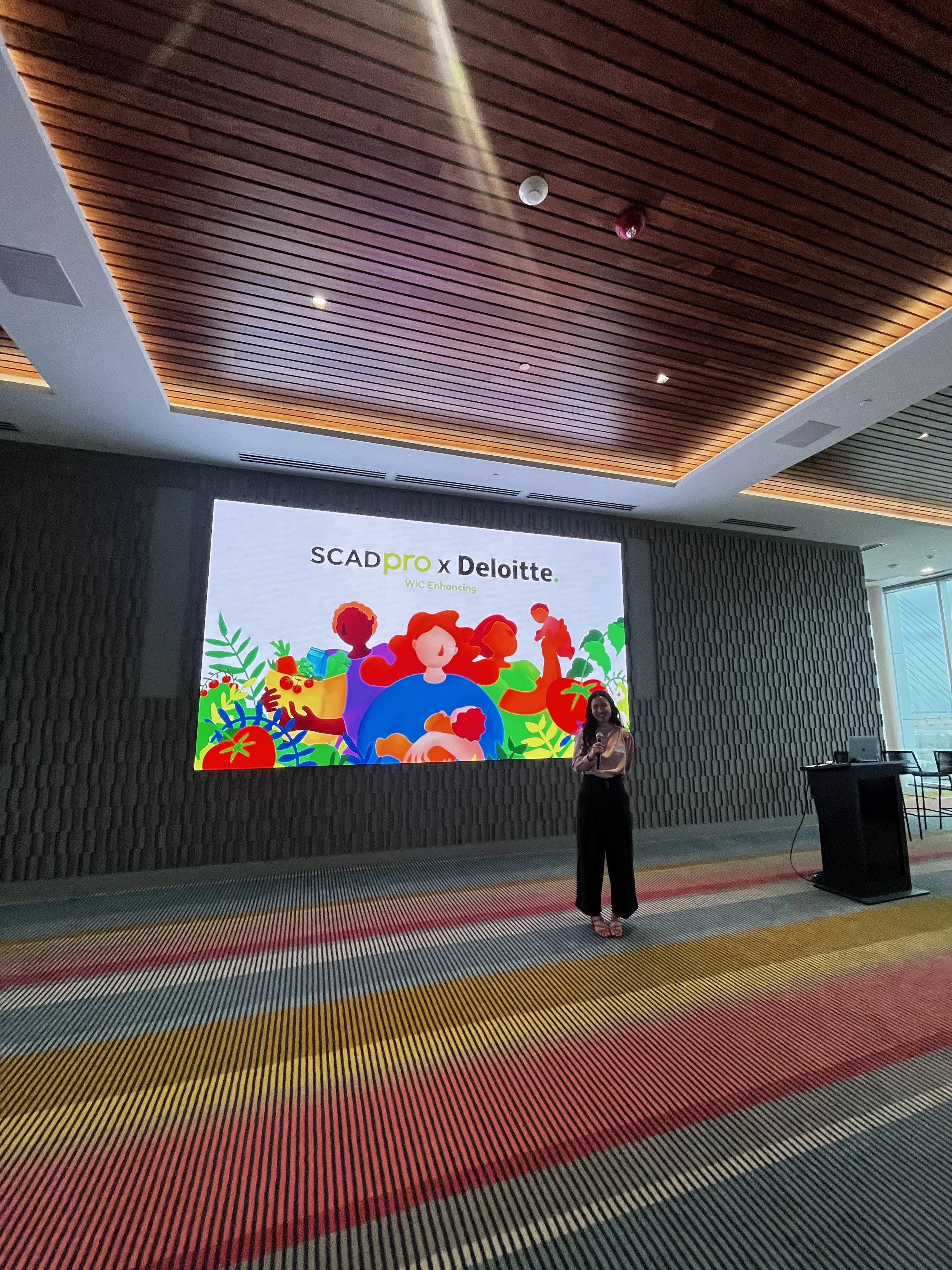
Redefining public service access through insight-driven campaign strategy

Led a multi-channel awareness campaign to improve access to public benefits for underserved communities. I developed personas, messaging frameworks, and visual assets that transformed confusing eligibility information into clear, empowering communications. By applying service design and marketing strategy, I helped reframe the government brand voice and boost trust and engagement by 25%.
Highlights:
Brand repositioning for government communications
Campaign messaging + content strategy
Stakeholder alignment and asset rollout
Research-led storytelling for high-impact outreach
THE PROBLEM
The SCADPro collaboration with Deloitte focused on addressing barriers to access in a government Program, which provides nutrients and health services to low-income families. Despite its importance, the Program faces challenges like low awareness and accessibility, limiting participation.
The Deloitte team highlighted core challenges facing the Program program, including limited resources that prevent effective connection with eligible families. Currently, only 51% of eligible families are enrolled with key barriers being low awareness, difficulty accessing systems, inflexible office hours, lack of online application, privacy concerns, and cultural and language challenges.
ROLE
Research, UX/UI, Design Strategies, Marketing Campaigns
THE OPPORTUNITY
To address these issues, we aim to conduct market research, develop customer personas, and journey maps, and create a marketing strategy to elevate Deloitte’s brand while increase awareness, improve accessibility, and help more families benefit from the Program services.
TIMELINE
September 2024 - November 2024
TOOLS
Figma, Figjam, Adobe InDesign
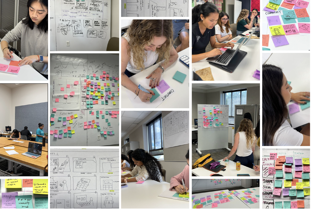
THE PROCESS
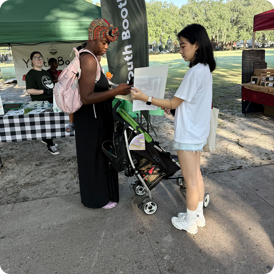
We conducted surveys and interviews at local markets where Withe Program benefits are being offered. The primary research was undertaken to gain first hand insights into the needs and preferences of our target audience: parents with young children. The aim was to included voices from diverse demographics, ensuring a comprehensive understanding of its impact and area of improvement.

INSIGHTS
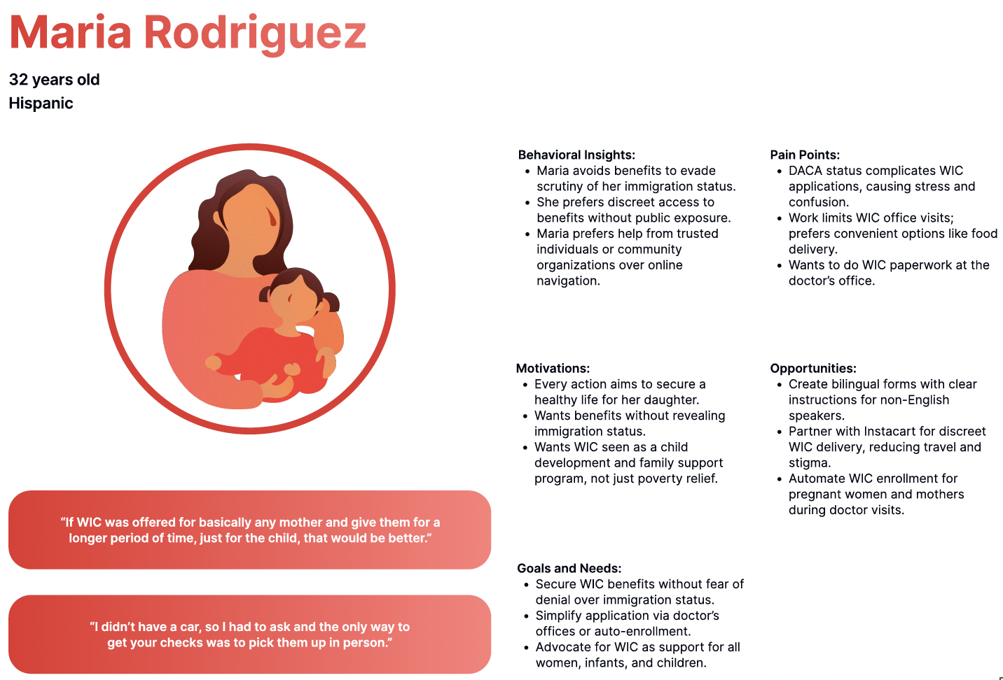
We collected more than 1,100 data points through interview sessions, highlighting critical themes that emerged from participant’s experience. The significant of these insights lies in their ability to inform program improvements and address the barrier faced by Program participants. Key areas of focus include eligible products, convenience, lack of outreach and awareness, the complexity of the application process, feeling of shame and social stigma, challenges with renewal, and issues related to transportation in both remote and urban settings. Understanding these factors is essential for developing targeted solutions that enhance engagement and support for families in the Program. We then create four user personas that represent the diverse needs and behavior of our target audience.


USER JOURNEY
We create a user journey map to outlines the user experience from initial awareness to program retention. Throughout the journey, challenges such as stigma, complex application, confusion, store mistreatment, transportation issues, and difficult paperwork impact the experience. The journey map identifies both pain points and opportunities to make the Program more accessible and effective for families.

THE CONCEPT
I truly enjoyed the concept development part like most designers. We established a concept identity to serve as a foundation for design development. The guiding theme chosen was Hope, centered around three core drivers: community, comfort, and nourishment. We used a Lean UX Canvas to formulate our concepts, which guided our approach the improve the Program. These concepts emerged from our analysis of the needs and preferences identified in our research, allowing us to create targeted solutions that resonate with our audience.
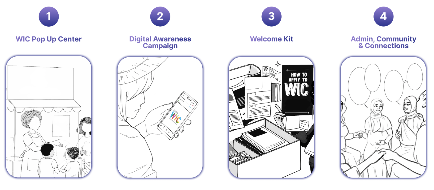
THE CAMPAIGN
My focus is on the digital awareness campaign where the Program would acquire more participants if eligible families attain more awareness of the eligibility with targeted advertisements.
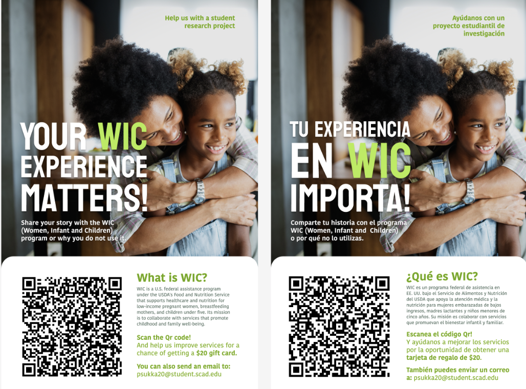
THE POSTER
The first touchpoint is a campaign poster to raise awareness among parents with young children, placing in in hospitals and grocery stores. They would be able to scan a QR code which links to an eligibility quiz, making the Program info easily accessible. This campaign addresses a lack of awareness, helping parents access resources to support family nutrition and well-being.
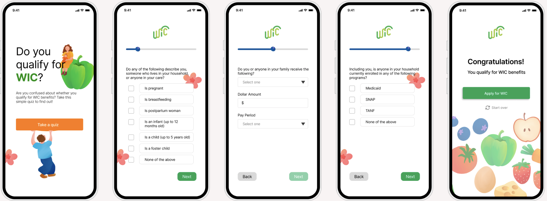
THE QUIZ
A simple tool to quickly access the Program eligibility. The quiz support the digital campaign to combat misinformation and raise awareness and other assistance programs.
Users can scan the QR code on the campaign poster to access the intuitive quiz. At the end, they receive their eligibility result and a call to action to apply for the Program, enhancing the application process.

THE RESULT
We centered our approached around three-essential pillars: Awareness, Access, and Activation.
Awareness became our first focus where we realized that not many families know the benefits the Program offers or if they are eligible. This would increase visibility and understanding of the program’s value.
Access is the phase that simplifies complex eligibility requirements and intimidating paperwork through a human-centered approach.
Activation highlights the importance of continuous engagement and emotional support to keep families connected to the Program resources over time.
We aim to create a bridge — not only to guide families to support but also foster a sense of belonging
MY TAKEAWAYS
1. Storytelling through personas is a powerful guide.
Crafting personas helped me deeply understand the people behind the problem and bring their voices into every phase of the design process. It wasn’t just a research artifact, it was a storytelling tool that kept the team grounded in empathy and helped guide meaningful design decisions.
2. A better experience goes beyond convenience.
This project taught me that improving a service isn’t just about reducing friction or increasing efficiency. True impact comes from designing systems that foster trust, create easier access to care, and reduce disparities, especially for underserved communities.
3. Growth lives in ambiguity.
Navigating this complex, high-stakes project pushed me outside of my comfort zone. I learned to lean into uncertainty, ask better questions, and stay adaptable, skills that will continue to shape how I approach challenges in design and beyond.